Neutral Living Room Ideas That Don't Feel Boring


Neutral living rooms get a bad rap for being boring. In reality, the most sophisticated interiors in the world rely on layered neutrals. The trick is that neutrals done badly (beige walls, beige sofa, beige rug) do feel flat. Neutrals done well use texture, tonal variation, and a careful touch of contrast to create spaces that feel collected and deliberate, not empty.
This guide covers the 7 principles behind neutral rooms that feel alive, plus the specific pairings and materials that elevate them.
Why Neutrals Feel Boring (And How to Fix It)
Neutral rooms feel boring when every element matches in tone, texture, and weight. Beige sofa, beige walls, beige rug, no variation. The eye has nothing to land on. The fix is layering: multiple neutrals within the same warm or cool family, combined with texture and material variation.
Principle 1: Layer Tones Within the Same Family
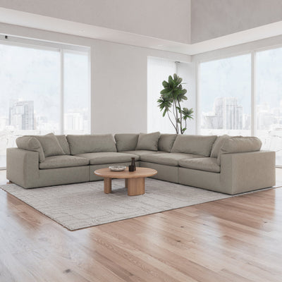
Within the neutral palette, pick 5 to 7 tones that share an undertone (all warm or all cool) but differ in depth. Example warm palette: cream, oatmeal, warm beige, taupe, saddle, and chocolate. All warm, all neutral, but six distinct tones. The room reads as intentional rather than monotone.
For cloud couch colors that anchor a neutral palette, see our cloud couch colors guide.
Principle 2: Add Texture, Not Color
If you cannot add color, add texture. Linen, boucle, wool, jute, hide, leather, ceramic, raw wood, polished wood, brass, ceramic, and wicker all bring visual interest to a neutral room. A room with 6 tones and 10 textures reads as rich; the same room with 6 tones and 2 textures reads as flat.
For linen specifically, see our best linen sofas guide. For leather options, see our leather sofas guide.
Principle 3: Use Contrast Sparingly
One or two pieces of deep contrast (black, navy, forest) in an otherwise neutral room create visual anchors without breaking the palette. The contrast is the exclamation point. Too much contrast and the neutrals become the background for a cluttered scheme.
Classic application: a neutral sofa, a black floor lamp, and a black-framed piece of art. Three contrast points, strategic and quiet.
Principle 4: Lean Into Natural Materials
- Wood floors, exposed beams, wood furniture: add warmth and variation
- Wool or jute rugs: texture, warmth, and honesty
- Leather accents: age and patina
- Ceramic and stone: introduce coolness to warm palettes, balance
- Linen and cotton textiles: breathability, slight irregularity
Principle 5: Mix Warm and Cool Carefully
Pure warm neutrals feel rich but can feel heavy. Pure cool neutrals feel modern but can feel cold. The best neutral rooms lean 80 percent warm or 80 percent cool, with a 20 percent accent of the opposite temperature. Warm room: 80 percent beige and cream, 20 percent cool gray accent. Cool room: 80 percent cool gray, 20 percent warm wood tone.
Principle 6: Let One Piece Have Drama
Every neutral room benefits from one piece that breaks the rules. A vintage Persian rug. A large piece of abstract art. A bold-colored accent chair. One drama piece prevents the palette from becoming monotone. See our mixed sofas guide for mixing logic.
Principle 7: Lighting Is the Secret Weapon
Warm lighting (2700K) elevates any neutral palette. Cool lighting (4000K+) makes neutrals look clinical. Layer three light sources at different heights: ceiling, mid-level, and floor. Dimmers are mandatory for a neutral room to feel right morning and evening.
Neutral Palettes That Work
- Warm beige palette: cream, oatmeal, warm beige, camel, saddle brown, with matte black accents
- Cool greige palette: pearl gray, warm gray, greige, dove, charcoal, with brass accents
- Earthy neutral: clay, terracotta, taupe, stone, warm white, with deep olive accents
- Scandinavian white: warm white, light linen, pale oak, silver gray, with black line accents
- Japandi: oatmeal, pale wood, soft black, clay, with moss green accents
Common Mistakes
- All matching tones in one undertone (no depth variation)
- Matching textures everywhere (all smooth or all matte)
- Mixing warm and cool 50-50 (feels uncommitted)
- Skipping the drama piece (room feels generic)
- Wrong lighting temperature (cool light in warm palette)
For broader design strategies, see our small living room layout ideas, behind-the-couch decor ideas, and the cloud couch colors guide.
Cloud Couches in Refined Neutral Tones
Sofatica cloud couches come in carefully curated neutrals: beige, white, gray, and anthracite. Each shade designed to layer into a sophisticated neutral palette.
Shop Neutral Cloud Couches


