Monochrome Living Room: How to Layer One Color Like a Pro

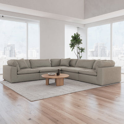

A monochrome living room looks effortless and is harder to pull off than almost any other palette. The illusion is that everything just happens to be the same color. The reality is a deliberate layering of 5 to 9 shades within one color family, plus a careful rotation of textures, finishes, and materials. Get it right and the room feels sophisticated, calm, and designed. Get it wrong and it feels flat, gray, or like a single-color Pinterest joke.
This guide breaks down the 5-step method for pro-level monochrome rooms.
Why Monochrome Is Hard
In a multi-color room, color provides contrast. In a monochrome room, there is no color contrast, so every other contrast has to work harder. You need contrast from tone (light to dark), texture (smooth to rough), finish (matte to glossy), and scale (large to small).
When monochrome rooms fail, it is usually because the designer relied on a single shade and a single texture. The result is a room that feels painted-in rather than styled.
Step 1: Pick Your Color
The best monochrome rooms start with a color that has natural depth and warmth. Easier colors:
- Warm beige: cream to saddle brown range
- Blue: sky blue to navy range
- Green: sage to forest range
- Gray: pearl to charcoal range
- Terracotta: dusty to burnt range (see our terracotta living room guide)
Harder colors: pure red, pure yellow, pure purple. These have narrow ranges that feel intense at every shade.
Step 2: Build the Shade Ladder
Within your chosen color, pick 5 to 9 shades ranging from lightest to darkest. Example for a green monochrome room:
- Pale sage (walls)
- Warm oatmeal with green undertone (ceiling)
- Soft sage (sofa)
- Classic sage (accent chair)
- Deep olive (rug)
- Forest green (throw pillow)
- Dark hunter (art accent)
Each shade has a specific role. The lightest is the biggest surface. The darkest is the smallest accent. The eye travels across the shade ladder naturally.
Step 3: Layer Textures
In monochrome rooms, texture carries the visual weight color usually carries. Aim for 6 to 10 different textures:
- Linen (sofa fabric)
- Wool (rug)
- Jute or sisal (secondary rug)
- Ceramic (vase)
- Wood (coffee table)
- Leather (accent chair)
- Boucle (pillow)
- Velvet (throw)
- Polished metal (lamp)
- Matte paint (walls)
For fabric and material ideas, see our linen sofas guide and leather sofas guide.
Step 4: Mix Finishes
Finishes add dimension no color change can provide:
- Matte: walls, linen, wool
- Glossy: ceramic, polished wood, glass
- Satin: velvet, painted furniture, brass
- Raw: natural stone, reclaimed wood, unfinished ceramics
A monochrome room with all-matte finishes feels flat. All-glossy feels cold. Mix for depth.
Step 5: Add One Rule-Breaker
Every great monochrome room has one piece that breaks the palette. A black-and-white photograph. A vintage brass tray. A small piece of pure white pottery. This single rule-breaker keeps the room from feeling closed off and decorative.
The rule-breaker should be small. If it is large, it becomes the star and the monochrome concept collapses.
Monochrome Examples by Color
- Monochrome warm beige: cream walls, oatmeal sofa, camel rug, saddle leather chair, chocolate art
- Monochrome blue: sky blue walls, deep navy sofa, steel gray rug, cobalt art
- Monochrome green: pale sage walls, deep olive sofa, forest rug, eucalyptus decor
- Monochrome gray: pearl walls, warm gray sofa, charcoal accents, black art
- Monochrome terracotta: cream walls, dusty terracotta sofa, burnt terracotta rug, rust accents
For specific sage green pairings, see our sage green sofa guide. For cloud couch color choices that work in monochrome, see cloud couch colors guide.
Common Mistakes
- Too few shades: 3 shades feels flat, need 5 to 9
- All the same finish: need mix of matte and glossy
- Ignoring texture: monochrome rooms fail without texture variety
- Missing the rule-breaker: rooms feel too closed without one outside element
- Picking too hard a color: start with beige, blue, or green; skip purple and yellow for first monochrome attempts
For broader neutral styling, see our neutral living room ideas.
Cloud Couches in Layered Neutrals
Sofatica cloud couches come in shades that layer cleanly into monochrome palettes. Beige, cream, anthracite, and forest-green options designed to work within a color family.
Shop Cloud Couches


